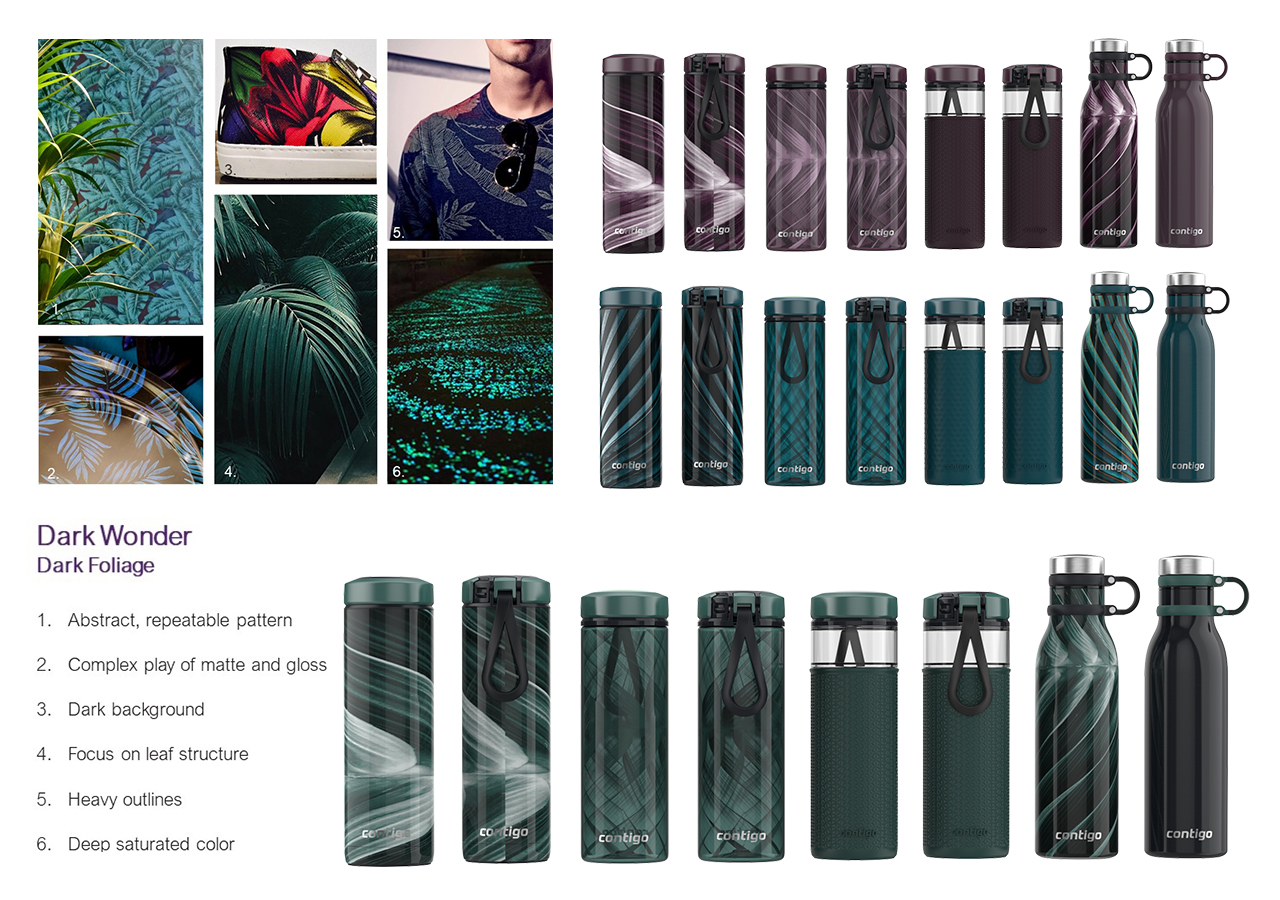
HOW MIGHT WE ELEVATE A BEVERAGEWARE PRODUCT INTO A FASHION ACCESSORY AND DELIVER AN INNOVATIVE LID TECHNOLOGY?
Based on that ambitious question, the following development took place over a three year period, while the acquired company struggled to get all the moving pieces together to fulfill that ambitious brief. While this project spanned many years, I was the only stakeholder from the design team to be involved from the project's conception through to production. The key criteria that needed to be addressed in order to successfully pull off this project were as follows:
Develop a universal lid with a unique opening mechanism, that works across glass, stainless steel and plastic.
Develop a product where the lid proportions are minimal and the body becomes the visual focal point.
Develop a design language that pulls all three products into a cohesive family.
Make each product adaptable to a wide variety of innovative CMF (Color, Material and Finish).
Develop a series of seasonal trend collections that will help promote the products as a family.
UNIVERSAL LID DEVELOPMENT
For the universal lid development, I worked with in-house design engineer who took the lead to develop a variety of solutions and then together we prototyped and down-selected the most unique and convenient opening experience.

SIDE VIEW
The lip of the spout and corresponding latch is designed to be the same across the steel, plastic and glass versions for a secure closure.

CLOSED
The orange latch inside the lid hooks underneath the spout rim for a secure seal.

OPEN
As you rotate the cover the latch moves along with it to release the lid.
DESIGN REFINEMENT
After the lid mechanism details were finalized, I led the process of refining the lid design. At first the exploration circled around carving out the surfaces to look more in line with the "sculpted" surfacing of most Contigo products.
But it immediately made the lid feel more like a sports or outdoor product, instead of a high-end fashion accessory. To combat this effect, the design details were limited to a few key chamfers that reduced the visual weight of the lid and made it feel more like a fine tailored product.
The handle feature took a lot longer to resolve, taking several iterations to finally land on something that felt right for this new "high end fashion" aesthetic platform.

While the rest of the product advanced through to the engineering phases, I continued to evolve the design of the handle. At the beginning, the team agreed upon a more "lasso" like tether which would be molded to fit onto one of the hinge pins.
But after further development of the bodies, the team reconsidered the "lasso" tether to look too much like a subway strap. I went back through my sketches and evolved a design where the tether would lay flat against the body. The silicone would be molded to look like a crossed ribbon to give it a small touch of fashion.
STEEL & PLASTIC DEVELOPMENT
The conversation on how best to launch this new line of products was especially challenging given the company was transitioning leadership teams following an acquisition by Newell Brands. The Evoke project became one of the only products that made it to market during the corporate reorganization because the new leadership team was impressed by the innovative function of the lid and ambitious aesthetics.
The Evoke body was the first product in the Contigo portfolio that would be designed specifically for a variety of CMF treatments. It was imperative to keep the body perfectly straight, so that it could handle everything from Physical Vapor Disposition (PVD) to heat transfers. The steel and plastic bodies were developed simultaneously to test the suppliers' capability of executing a more advanced CMF design.
The company's supplier base was slowly growing because of new acquisition resources, so we utilized our existing products to ask for sample of their CMF capabilities. We also asked for small trial runs, in order to see how consistently they could execute each decorative treatment and to see if it would pass our high engineering testing standards. Through this process, we were able to eliminate things like heat transfer and hydrographics, which didn't pass our scratch tests or environmental standards.
Plastic Body Sample
IML (IN-MOLD-LABELING)
For the plastic body, we settled on IMLs as being the best way forward because no one else in the beverage-ware industry appeared to be utilizing this technology, which was becoming very popular in the packaging industry. I had previous experience with IMLs and so was able to optimize the body for manufacturing. But our existing supplier base did not have much experience in applying IMLs and we couldn't afford to move production elsewhere. After round 8 of unsuccessful IML samples, the plastic version officially got put on hold. Our marketing had also noticed a dip in plastic water bottle sales and so we thought it would be a better investment to develop a steel and glass version only.
Steel Body Sample
DOUBLE SILK SCREENS
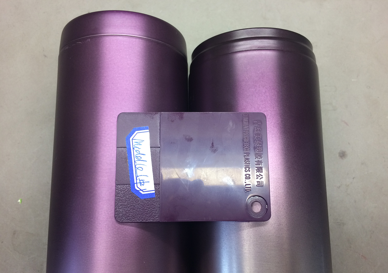
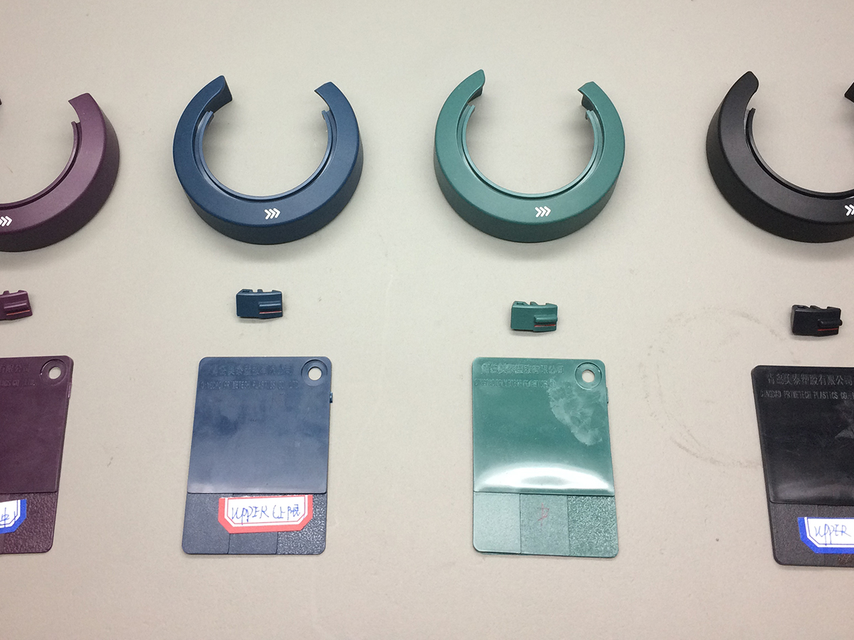
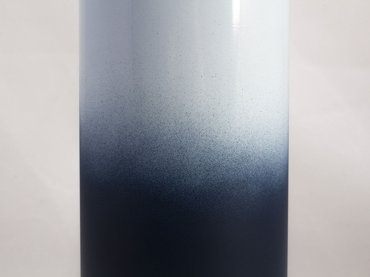
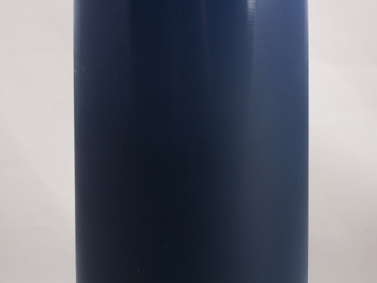
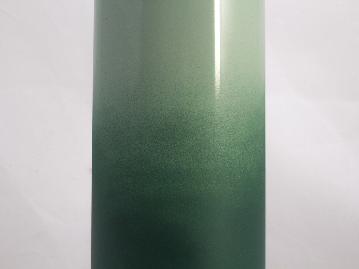
By this time, it became critical to do at least a soft launch of the stainless steel version, since the product had already begun to be sold into our retailers. Based on supplier samples, we knew that a double silkscreeen would be easiest to execute. The painted gradient layered underneath would also help hide any mistakes, especially if we could get both paint colors to closely match. Unfortunately, the sub-supplier struggled to get the right color match and paint finish (see body on the left). The body on the right is the correct color which we successfully developed after I flew to the factory in China to ensure we met our SFS (ship from stock) deadline.
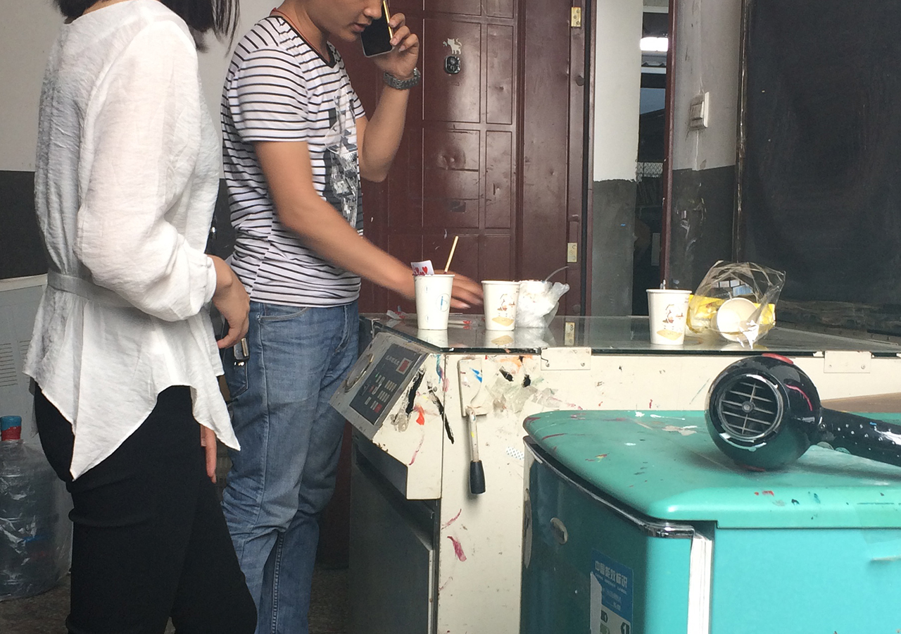
SUPPLIER VISIT
Color evaluations for this family of products was challenging because the lids were manufactured at one supplier in Northern China and the bodies were manufactured at a different supplier in Southern China. As a result, the trip required a lot of air, rail and car travel. But I carried with me the plastic samples that had already been approved and used those as the benchmark for the other color evaluations. I also took this opportunity to scout out samples for the future glass product and the success of this trip gave me another opportunity to travel back to China for different project later that year.

GLASS DEVELOPMENT
The lid attachment for the glass version had already been partially developed through the plastic and steel versions. As a result, there was a lot more time to develop each design option in more depth. Below are six potential glass archetypes that still fit within the Evoke family and a supporting image board. Several directions were selected to move forward into development.


There was a lot of support for a silicone sleeve that covered most of the glass body to ensure users would feel secure that their bottle would not break. Other glass products in the Contigo portfolio features silicone sleeves with a perforated pattern, so this direction would evolve that by having a 3D pattern with no perforations. The idea of a fabric sleeve also had a lot of traction with the team, regardless of whether the silicone bottom pad was hidden or exposed. Finally, a few wanted to see the half-sleeve design further developed as well.
I had sufficient time to develop each design direction into several different colorways and patterns in CAD and develop compelling imagery to sell the product to the new leadership team. The same glass body, with a slight inset, could be used for the full fabric or silicone sleeve, since we would want the proportions to be at the same height. The half sleeve option would require its own unique glass body.


After investigating our new supplier resources and seeing the potential design options, the leadership team decided to put the fabric sleeve options on hold. Instead, the leadership team decided that it would be better to move forward, with the design that would be fastest to execute, so the full silicone sleeves with a variety of 3D patterns was selected.
TREND REFINEMENT
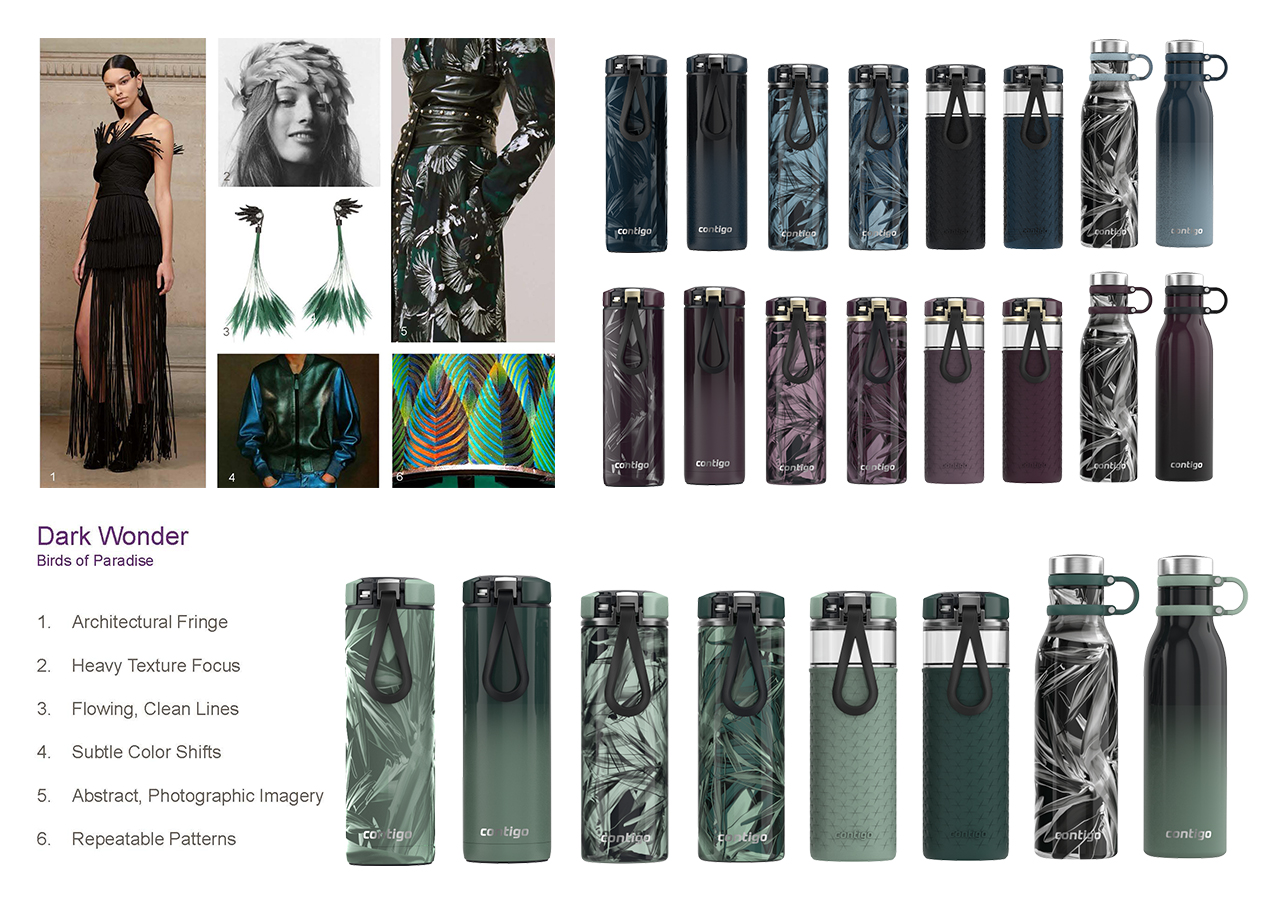
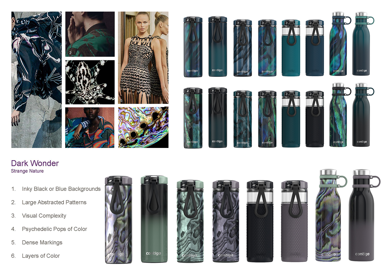
Under the new leadership, the marketing team thought it might be possible to expand the program into multiple products and revive the plastic version through a new heat transfer supplier. With this idea of a full platform launch, I had the opportunity to think through the design details that could make the whole thing feel like a unified family of products. With new access to WGSN resources, we began by developing a full trend report to give us a starting point for seasonal mood boards that closely aligned to the fashion industry
After pitching the idea, the leadership team thought that it might be too ambitious and risky to have an expanded program for a brand new product. They preferred to utilize our existing and historical best sellers for expanded programs. The project team was able to quickly pivot and we were able to develop a new set of designs that could be fast-tracked to market.

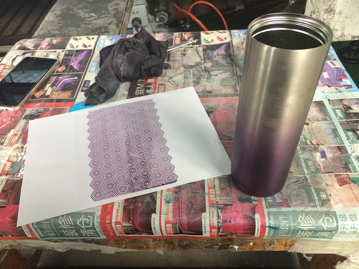
The soft launch of the stainless steel product with a double silkscreen and paint gradient provided a starting point for this new collection of designs. We decided to simplify matters, by only featuring the paint gradient, under the continuing trend of "Ombre" products. A wide variety of colorways were proposed, so that we could produce a new wave of product for each upcoming season. We also decided to elevate the logo treatment by using laser etching for the steel version and metallic silkscreen on the glass version.
FINAL PRODUCTION
After training with our in-house CMF designer, I had the opportunity to oversee the color sampling process and evaluate the quality of the paint gradients. We tried to ensure a successful execution by our suppliers through the development of "golden samples" or paint gradient benchmarks with a local model shop. Five copies of each colorway were developed, so that each supplier would have one copy and each Newell office would have a sample.

After a few rounds of sampling, it became obvious that our suppliers could not replicate these one-off samples in a mass manufactured setting. Instead of the using the golden samples, I began using competitive market samples to benchmark whats possible in mass production.
Model Shop Golden Sample
Supplier Samples
Competitive Market Samples
Unfortunately, when we did a side by side comparison of our supplier samples with competitive market samples, the paint gradient was obviously too splotchy and uneven. The supplier could not develop a automatic spray gun line for mass production, so each body would have to be hand painted. As a result, we had to eliminate the colorways where the top color was too light and instead substitute it with a darker color. The color switch helped to conceal the paint gradient inconsistencies and make the transition appear smoother. In the end, we ended up with 4 colorways.

After 3 years, the Evoke family of product moved to final production and can be found at several retailers. The product can also be purchased on the company website.
Marketing Photography
The product platform behind this series of products, where beverageware can double as a fashion accessory, inspired a multitude of project briefs along the same vein. It helped shape the product road map for the brand and became a benchmark for future product innovation.